
Responsive Web Design is the “in” thing at the moment. If you’ve ever heard of the term and never known what it was, keep on reading to find out more.
What is Responsive Web Design?
Responsive web design is the practice of creating your code to respond to the size of your screen and display information depending on that screen size. Trying to display the exact same content, shaped exactly the same on a desktop and a mobile device is virtually impossible.
But what if there was a way, to simplify the design on mobile devices, and placing everything under each other while allowing you to have a full screen, the wide design on your desktop. Well, that’s where Responsive web design comes into play. While the content stays the same, the code around the content tells the content to do different things depending on what screen you are viewing the site on.
So why is that beneficial for your business’ website?
Here’s why…
Your audience is on mobile
It’s 2017. The phone to the desktop is the tv to the radio. Internet usage on mobile phones is on a constant growth. With many users now browsing the web purely on mobile, having a website that is responsive to your mobile device allows a good and easy experience for your reader, which helps them understand your business and services better. Having an outdated website that is not responsive requires the reader to zoom in, pan around, get lost, and potentially move on to the next site.
Google Ranks it higher
Google officially released an update to their search engine algorithm that puts responsive websites up higher on their search compared to non-responsive websites. With a higher ranking website, that gives you a much better chance of promoting your websites and having leads find your business’ website.
Futureproofing
The technology industry rapidly evolves. Newer devices come out every year with many different screen sizes across a lot of different brands. Having a responsive website future proofs your site for whenever there is a new device size, as it will adjust accordingly. No more need to constantly update specific sizes and constantly refine the micro details in your design.
Cost vs a Mobile App or Separate Mobile Site
The alternative to a responsive website is a mobile app or a separate mobile version of your site.
A professionally developed phone app can cost anywhere from $50,000 to the sky’s the limit. A mobile version of your site can be very clunky and require a lot of resources in the back end to syndicate all the content on your mobile site and desktop site. Think of them as literally, two separate websites trying to load the same content all the time. It also would come with double the price tag of a normal website.
How do I know if I have responsive web design?
Now that you have a better understanding of the importance of responsive web design, it’s time to check to see if your website is actually responsive. To do so, the first check is to actually go on your mobile and check if your website is responsive.
A few pointers that will most likely determine your site is not responsive:
- If your website is zoomed all the way out and entirely fits on the whole screen.
- half or most of your website cuts off on the right.
See examples below:
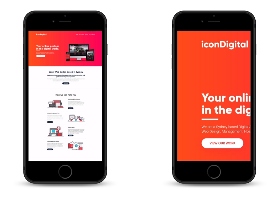
If the menu cuts off too or doesn’t have the famous hamburger menu (see below) then that is another indicator.
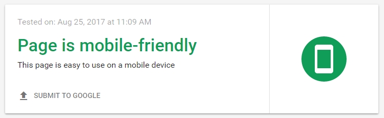
The next step is to check with Google to see if your website is responsive. Or as they put it, Mobile-Friendly.
https://search.google.com/test/mobile-friendly
When tested, you want your result to show:
What to do if your site isn’t responsive
If your website is not responsive, now is the perfect time to upgrade it. If you still have a connection with your current web team, call them up and ask them about it.
Alternatively, let us look at your site and propose how we can build your website with responsive technology. Contact Icon Digital for more information.